1.Text without visual component: See blog post below – all text; no images
2. Visual without text: a picture of my family.

3. Adapted to specific audience, purpose and context: image of a family working together found on Lds.org’s page encouraging FHE.


5. Classification: this made me think of the Classification of Living Things that I learned about in 9th grade biology. I found this image depicting the different classes on http://questgarden.com

6. Comparison and Contrast: I thought of the term chiaroscuro from my art history classes which means the contrast between light and dark. The way that light is used in an image can change the way the audience understands it. I chose a still image from Wells’ 1952 version of Othello. Othello’s face is almost completely in obscured by shadows while Desdemona’s face is illuminated. The light shining on Desdemona symbolizes her innocence and purity.

7. Description: In this example, the text gives meaning to the visual details.

8. Narration: this statue stands at the Winter Quarters monument. It tells the tragic story that many pioneers experienced as they crossed the plains: the death and burial of a child.

9. Pattern/Repetition: the example in the book made me think of tessellations. I especially love this one by M. C. Escher. It is a good example of contrast as well.

10. Point of View: I probably should be careful of using pictures that I have taken, but I stood partly underneath the Eiffel Tower as I took this photo. I think it creates an interesting curve.

11. Proportion: Picture of my mom and I at Stonehenge. I asked my dad to zoom all the way out so that the viewer could understand how massive the structure was as it dwarfed my mom and I.

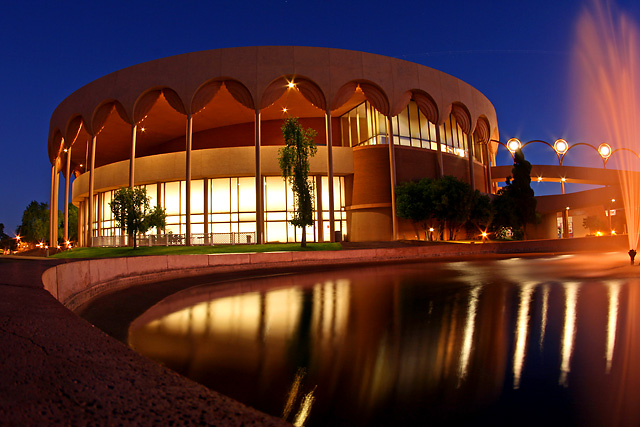
12. Unity: Frank Lloyd Wright designed a theater in Arizona that I went to many times in my life. Gammage Auditorium is a large circular building that is unified by the repetitive use of columns, circles, half-circles, and spheres. Photo from http://www.dpchallenge.com.
13. Emphasis: I think advertisements do this a lot. I found an ad for contact lenses that really makes the eye the focus of the poster.

14. Conciseness: being concise means that you are brief and to the point. I thought of this logo/button that encourages people to vote. The creator’s purpose is clear, the colors are patriotic, and the design is simple and clean. From www.conservativeteapartycaliforniastyle.com

15. Tone: In writing, tone is the attitude the author has about what he or she is writing. I thought of Dorothea Lange’s photo entitled “Dust Bowl Farm.” The picture is black and white, the scene is desolate, the land is barren. All of this contributes to the picture’s tone of hopelessness and despair

16. Ethos: I am using Lds.org again. When you go to the page that explains the Church as an organization, there is an image of the First Presidency. I think that the site includes an image of the bretheren to show that they are wise, joyful, and respectable men.

17. Logos: is about reasoning and logic, so I thought of a staircase. This image shows what skills will be learned first, and then what the ultimate goal is at the top of the staircase. From http://it.toolbox.com

18. Pathos: image of homeless little boy. His clothes are tattered and he is almost transparent; representing how people just ignore the millions of impoverished children. This is a Unicef ad for a campaign in China. The caption reads "Don't ignore me."
19. Figure-ground contrast: I looked up the definition of this, and I think that this image is a well-known example.


No comments:
Post a Comment