1. Effective typography. I picked two magazine covers which display titles in fonts that have become iconic. The Time magazine font is a straight, stately serif font. It is firm and serious. It suggests that the articles inside are credible and important. The picture of Obama is also rather stoic. On the other had, Rollingstone also has an easily identifiable logo. The outlined, shadowed font is edgy and feels classic, like a rock star. The articles in here seem like they would be more edgy and entertaining too. On this cover Obama sports a goofy grin. Both are effective typefaces for the respective audiences of the magazine.


2. Ineffective typography. This is a friend of a friend's blog heading. It uses a script font. The font is distracting and hard to read--even when it is full size. I hope this person never sees my blog, but I think the heading is pretty darn ugly!

3. Serif typeface. The older Mac logos featured the Apple Garamond font.
4. Sans serif typeface. I bet that sans serif fonts are very popular for company logos because they are clean and easy to read from far away.
5. Script typeace. My husband works with other paintball companies, so I am used to seeing their logos all the time. This is one of my favorite ones. I think it looks really pretty--almost like calligraphy.
6. Novelty typeface. Another paintball logo. This one is pretty awful, but the font is kind of cute.

7. 12 pt font in body of text. An example of a lovely MLA research paper showing the lovely 12 pt font.

8. 14 pt heading. From http://bestwebdesignz.com/

This works too:
This is a 14 pt heading
The 14 pt Trebuchet heading really stands out from this 10 pt text
9. Italic type. I realized that most sports team's logos are in italics. I wonder why. Perhaps to convey speed and agility?

10. Boldface type. A nice pun, as well as an example of reverse type. From http://www.winoca.com/BoldfaceBooks.html

11. All caps. Ad for French Connection clothing

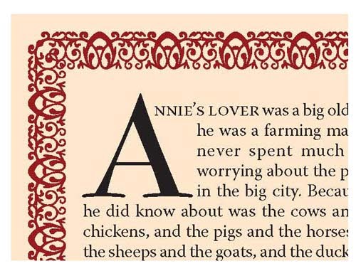
12. Small caps. I see this a lot at the beginning of chapters. From http://layersmagazine.com
13. Shadow typeface
14. Reverse type. Found at:http://www1.eere.energy.gov

15. Colored type: I love those red, sans serif letters!

16. Kearning. The spacing is off in all three examples between the w and the a. It seems to be a little less noticeable in the sans serif font. If I knew how to fix the space, I would....
WAR Times New Roman
WAR Garamond
WAR trebuchet
17. Proper leading
This is an example of text that is spaced correctly. It makes it is much easier to read. I couldn’t find a nice image of an example, so I decided to make this one myself. It is 12/12.
18. Bad leading
This is an example of text that is spaced far too closely together. It is rather difficult to read. I couldn’t find a nice image of an example, so I decided to make this one myself. It is 12/6. It is so bad that it overlaps the top line!


21. Center justification. I love this poem!
HAD I the heavens' embroidered cloths,
Enwrought with golden and silver light,
The blue and the dim and the dark cloths
Of night and light and the half-light,
I would spread the cloths under your feet:
But I, being poor, have only my dreams;
I have spread my dreams under your feet,
Tread softly because you tread on my dreams
W.B. Yeats

23. Bad spacing between words. This is a good example of center justification too, but because all of the lines are one length, the individual words are rather hard to distinguish--they are far too close and randomly spaced. Found here: http://www.wetcanvas.com/forums/showthread.php?t=667081

24. This is the equation for photosynthesis. It uses both subscripts and superscripts

25. Pull quote from http://www.synergy-usa.com/new.htm

No comments:
Post a Comment