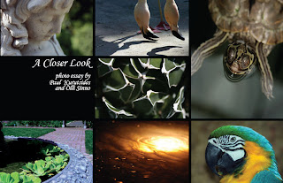
1 . Caption
2. Citation or reference to figure
3.Table with text/numbers
4. Flow chart: my friend made this funny dating flow chart:
5.Organizational Chart: we got these all the time in seminary!
6. Conceptual Design
7. Framing: This website used gray boxes to frame the graphics
8. Bar Graph
9. Line Graph
10. Pie Chart: I think this is a good pie chart. The contrast between sections is pretty good and the labels are clear
11. Pictograph
12. Ineffective/Wrong graph: I think pie charts are the most misused. This one is hard to read and understand and would be better off as a bar or line graph or simply as a list of information.
13. I have seen a few of these Multi Depth Pie charts, and I don't think they are fair because the 10 and 12 percent slices look the same height and it is hard to visually see the difference in the two aside from the different colors.
14. Line Drawing: because pictures are universally understood, I thought of the line drawings that are often in instruction manuals.
15. This pie chart only has a few call outs that identify each part of the chart.
16. Cross section graphs were used ALL the time in the PS 100. They are a must in Geology.
17. Motion: I stumbled across this today and thought it was intriguing. Click here to see an example of new Google Motion Charts. It is an interactive graph that depicts information over time with motion!
http://code.google.com/apis/visualization/documentation/gallery/motionchart.html#Example
This is probably a more traditional example of motion. To show motion, many times lines or images are blurred:
18. Boundaries: here is an image showing the zip code boundaries for Utah
19.Texture: I have this template for one of my other blogs. I like it because it looks like silky fabric. Texture is really popular on a lot of blog layouts right now--many of them look like scrapbook pages.
20. Silhouette: I love the look of silhouettes. We had some made of my husband and myself and our dog that are hanging on our wall.


