Tuesday, January 25, 2011

Journal 6

1. Good use of whitespace: I really like the layout of Overstock.com. There is a lot of whitespace but it actually helps to highlight the product being sold. Also the use of red is helpful in navigating the whitespace to the important parts of the page.


2. Poor use of whitespace: there is so much whitespace that my eye gets confused as to what to do first: should I look at the logo? Or the building at the bottom? Or read the text?


3. Portrait BYU poster


4. Landscape BYU poster


6. Triple column


7. Mixed Column grid: I am not sure if this is a good example, but here you see two distinct columns which are actually made up of different sized frames which kind of gives the illusion of having multiple columns within the columns. From frankenblogmeetsthewolfman.blogspot.com/


8. Heading flush with text: while the title of the fake paper is centered, the date and the heading are flush with the text.


9. Marginal heading


10. Numbers or letters: a clever poster explaining the "10 Commandments of Phlebotomy" using roman numerals to set off each section. From http://www.phlebotomy.com/

11. Bullets: a political campaign poster with bullets to draw attention to the candidate's platform. From http://www.blogforarizona.com/
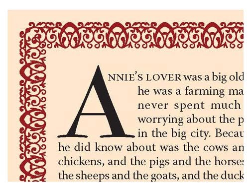

12. Drop Cap:


13. Good ordering of Information: this website is about immigration and it is very user friendly. The navigation bar is at the top and the options below the picture are in an eye catching color. It is easy to see what the website is about and find the link you want.


14. Poor ordering of Information: this website is also about immigration, but it is really hard to navigate. The menu has far too many options and the rest of the information is below the fold of the homepage.


15. Citation: while this is also an example of a watermark, it is now a convention to cite the original creator or owner of a photo by using a watermark or other symbol on the image.


16. Title and section head: After the title of the survey, the first section is labeled "Introduction"


17. Tabs or dividers: I wish it were a little larger, but this screen shot shows actual tabs to bring the reader to different pages. The tabs are next to the "Be the Buyer" logo and they read "Vote" "Available Now" and "Coming Soon." The grey/blue color of the tabs make them stand out.


18. Footer: this image runs along the bottom of each page of this website:


19. Watermark

20. Frame using solid or dotted lines: the white solid lines separate the pictures into small grids.


Tuesday, January 18, 2011

Journal 5

1. Effective typography. I picked two magazine covers which display titles in fonts that have become iconic. The Time magazine font is a straight, stately serif font. It is firm and serious. It suggests that the articles inside are credible and important. The picture of Obama is also rather stoic. On the other had, Rollingstone also has an easily identifiable logo. The outlined, shadowed font is edgy and feels classic, like a rock star. The articles in here seem like they would be more edgy and entertaining too. On this cover Obama sports a goofy grin. Both are effective typefaces for the respective audiences of the magazine.


2. Ineffective typography. This is a friend of a friend's blog heading. It uses a script font. The font is distracting and hard to read--even when it is full size. I hope this person never sees my blog, but I think the heading is pretty darn ugly!


3. Serif typeface. The older Mac logos featured the Apple Garamond font.

4. Sans serif typeface. I bet that sans serif fonts are very popular for company logos because they are clean and easy to read from far away.

5. Script typeace. My husband works with other paintball companies, so I am used to seeing their logos all the time. This is one of my favorite ones. I think it looks really pretty--almost like calligraphy.


6. Novelty typeface. Another paintball logo. This one is pretty awful, but the font is kind of cute.


7. 12 pt font in body of text. An example of a lovely MLA research paper showing the lovely 12 pt font.


8. 14 pt heading. From http://bestwebdesignz.com/

This works too:

This is a 14 pt heading

The 14 pt Trebuchet heading really stands out from this 10 pt text


9. Italic type. I realized that most sports team's logos are in italics. I wonder why. Perhaps to convey speed and agility?


10. Boldface type. A nice pun, as well as an example of reverse type. From http://www.winoca.com/BoldfaceBooks.html
11. All caps. Ad for French Connection clothing


12. Small caps. I see this a lot at the beginning of chapters. From http://layersmagazine.com


13. Shadow typeface
14. Reverse type. Found at:http://www1.eere.energy.gov


15. Colored type: I love those red, sans serif letters!

16. Kearning. The spacing is off in all three examples between the w and the a. It seems to be a little less noticeable in the sans serif font. If I knew how to fix the space, I would....

WAR Times New Roman

WAR Garamond

WAR trebuchet


17. Proper leading

This is an example of text that is spaced correctly. It makes it is much easier to read. I couldn’t find a nice image of an example, so I decided to make this one myself. It is 12/12.

18. Bad leading

This is an example of text that is spaced far too closely together. It is rather difficult to read. I couldn’t find a nice image of an example, so I decided to make this one myself. It is 12/6. It is so bad that it overlaps the top line!


19. Left justification. Also a good example of bad word spacing. Found at http://www.fodey.com/generators/newspaper/snippet.asp

20. Left justified with a ragged right margin. How I love MLA!
21. Center justification. I love this poem!


HAD I the heavens' embroidered cloths,
Enwrought with golden and silver light,
The blue and the dim and the dark cloths
Of night and light and the half-light,
I would spread the cloths under your feet:
But I, being poor, have only my dreams;
I have spread my dreams under your feet,
Tread softly because you tread on my dreams

W.B. Yeats


22. Right justification. Book cover with a right justified title. Also a nice example of a pull quote.

23. Bad spacing between words. This is a good example of center justification too, but because all of the lines are one length, the individual words are rather hard to distinguish--they are far too close and randomly spaced. Found here: http://www.wetcanvas.com/forums/showthread.php?t=667081


24. This is the equation for photosynthesis. It uses both subscripts and superscripts


Response to Journal 3

Here are the end results. Not bad for an "ama-toor," eh?


Tuesday, January 11, 2011

Journal 3

Here are some photos that I want to play with in Photoshop tomorrow:


I want to color correct this one, possibly crop it, and get rid of the camera strap coming out of my pocket.

I want to crop the ugly fence out of this one and undo the overexposure.


This one is easy: just remove the outlet and possibly crop.


I love this picture of Bella, but it is all wrong. I want to take out the leash and zoom in close to her face.